Bottle green, scratches and funky letters: Discovering the new Atlas ArenA identity


At the marketing department of Atlas ArenA Amsterdam (aka AAA) we have been feeling a sort of itch for a while. As our complex evolved into a vibrant, lively and energetic community, our branding style grew a bit stagnant. The original identity, developed at the beginning of last decade, has gradually became less relevant and felt slightly out of place. We've been long overdue for a rebranding... We needed a new, energetic approach that would reflect the current vibe of the campus.
A plan was put in place, and for the past 18 months we've been working closely with We Design to develop a new, fresh style for Atlas Arena. A year and a half feels like a long time, but there's really a lot to be covered to create a consistent, wide-ranging brand. Let us show you what we've done! The new style premiered last month, and we're so excited to share the fruit of our labor with you.

The task was to create a visual identity encompassing all aspects of campus life: building and area signage, amenities, hotspots, as well as all forms of communication, from newsletters to social media and the website. The identity needed also to be scalable for all future needs. This called for more than a logotype and a dedicated font.
Key elements of brand identity
After initial brainstormings and workshops we identified key brand pillars of the new AAA brand: vibrance, friendliness, professional but relaxed approach. A key assumption was to capture the essence of a perfect workplace: well maintained and professional, but also light-hearted and fun to work at. To achieve that, we introduced several elements of visual language. All those elements combined comprise AAA’s own visual DNA.
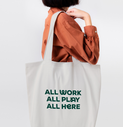
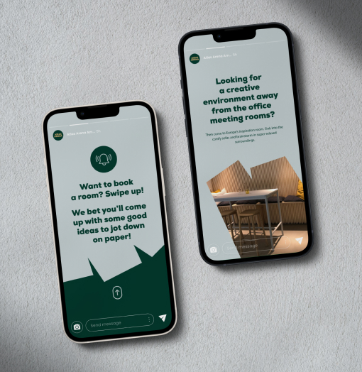
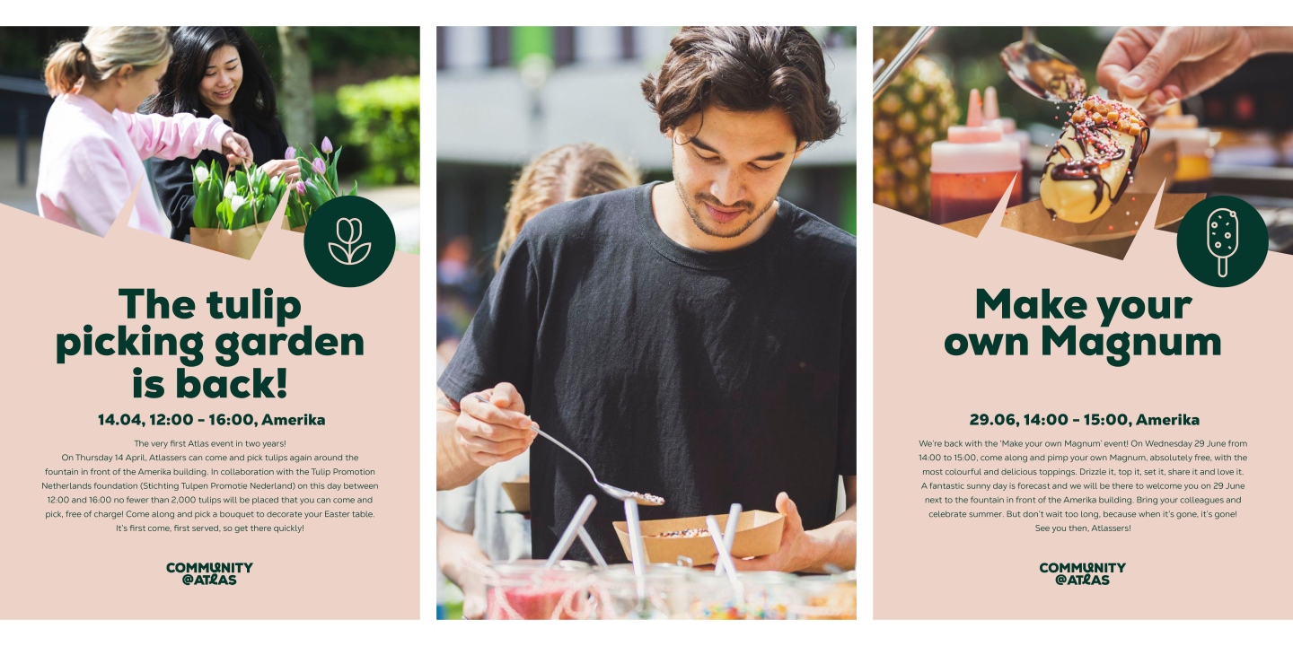
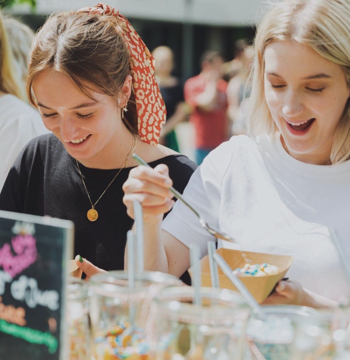
With legibility in mind, we picked a friendly, solid Nexa typeface and enriched it with several additional hand-drawn characters to add just the right amount of personality. To avoid boring rectilinear lines, a variety of so called "scratch shapes" was designed, serving both as picture frames and graphic elements. Rules for photography were set - making sure the campus and its people are portrayed in fun, engaging and contemporary way.
After several trial-and-error print tests, a colour palette was developed. Numerous icons were created. We also established a playful and informal tone of voice for communications.
Logotype
(and its many versions)
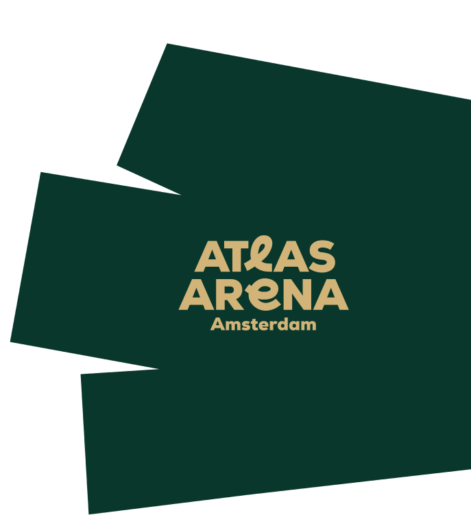
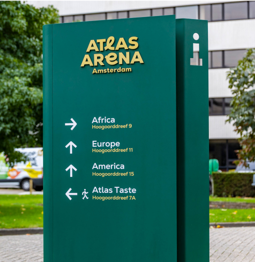
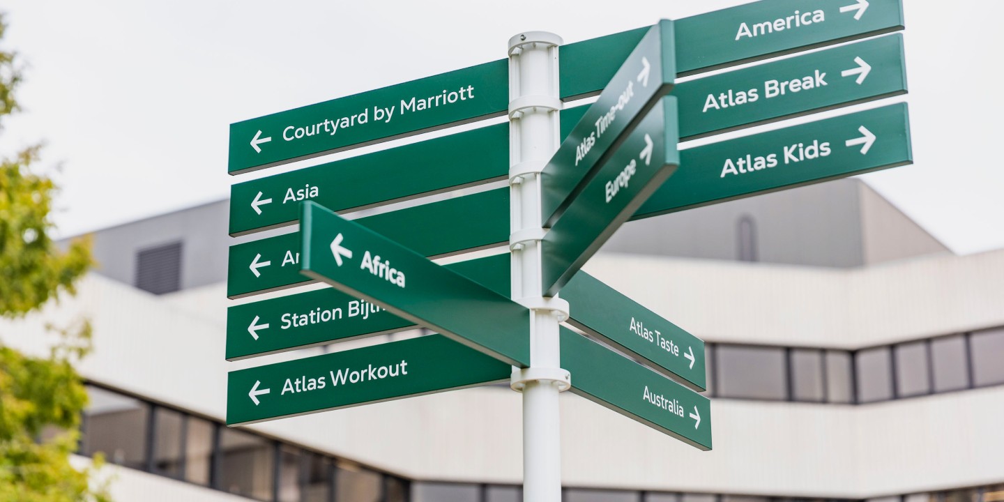
Up to this day, we have created over thirty logotypes for various AAA buildings, amenities and services. Each of them is instantly recognisable as a member of the brand family, thanks to the unified font and colour, and the use of so called funky letters – custom-made loopy shapes replacing individual letters in a logotype. There’s always at least one funky letter in each logotype. They are quirky, fun, and cheerful. They introduce personality. And what’s most important from a design point of view, they unify the identity, and make it scalable, ready for multiple future uses. Thanks to them, the new branding is instantly recognisable and like no other.
Colour palette
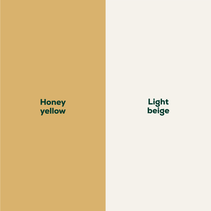
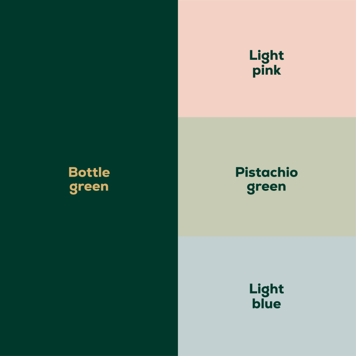
Atlas ArenA Amsterdam colour palette is divided into two parts. The base colours, Bottle Green and Honey Yellow (with light beige serving as a background) needed to be strong and noticeable, as they would be used for signage and main brand communications. The three additional colours, each assigned to one of the brand segments (Community, Convenience and Working), are earthy, calm and muted. Contemporary and inspired by nature.
Scratch
frames
The scratch frames and shapes break the boredom of a traditional layout. They are dynamic and playful, just like Atlas! Whether they are filled with pictures or serve as colourful backgrounds, they introduce joy and quirkiness to our visual communication.
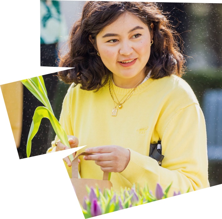
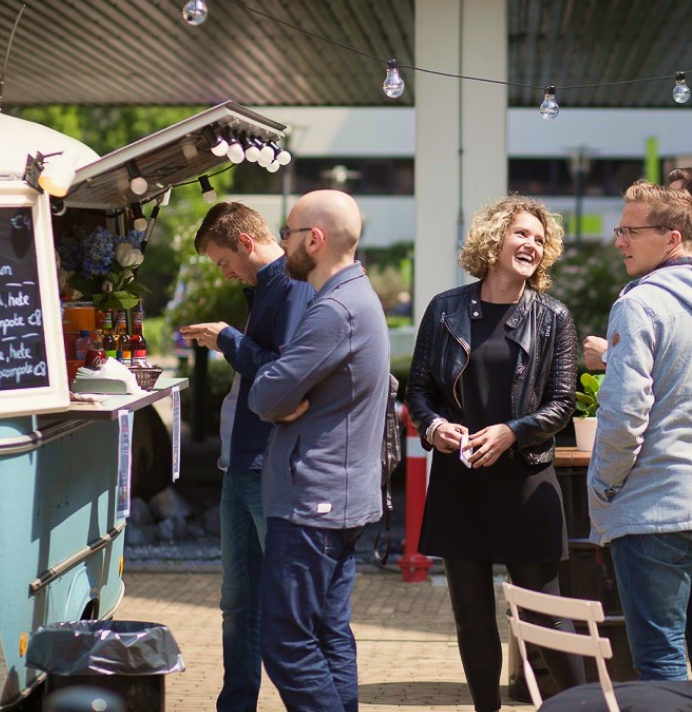
Photography
Thanks to a freelance photographer on stand‑by (and thoughtful GDPR practices) most of the pictures used in the AAA materials are our own, taken during real events on campus grounds. The photography is thus friendly, diverse and natural, with real people in real campus activities and situations.

Icons
To complement the brand, a diverse set of icons was created. Iconography is an important ingredient in Atlas materials - adding a lighter feel and personal touch to all materials. Quite often icons are complemented by funny taglines. We even created some animated versions for all of us to enjoy!
Tone of voice
With our tone of voice, we always try to make the person reading feel a little happier than they did before. We want to come across as fun, friendly and easy to work with. But not too edgy or casual. After all, we’re professionals. Short, confident sentences. A little bit of joking when it’s appropriate. We write how we speak, using contractions and simple forms, always searching for the easiest way to say things.

Signage
AAA signage follows the idea of funky letters - loops drawn in a single line. Each sign is a single sheet of metal, bent in a playful way. You can see for yourselves when walking on the campus how the main colours of Atlas ArenA Amsterdam - Bottle Green, Honey Yellow and off-white Beige - together create strong and legible visual language.
Do you like the new style?
Maybe you have some comments or questions regarding the new identity? Feel free to ask, we'll be happy to hear back from you and answer! You can always contact us at events@atlasarena.nl. Or feel free to e‑mail studio@wedesign.pl, our brand co‑creators.
Enjoy your day!